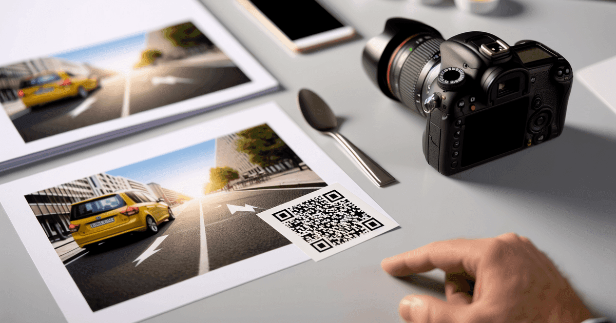
How to Design a QR Code People Actually Want to Scan
guides

How to Design a QR Code People Actually Want to Scan

I
Irina
·21 min read

Learn how to design a QR code that drives results. Our guide covers branding, scannability, sizing, and tracking to help you create codes that work.

When you’re learning how to design a QR code, the first choice you make is the most important. It's not about the colors or the logo—it's about whether your code is static or dynamic. This decision dictates everything that follows, from your campaign's flexibility to its ROI, making it a critical first step for any small business owner, marketer, or event organizer.

Your Foundation for a Scannable QR Code: Static vs. Dynamic

Illustrates static QR codes printed on paper and dynamic QR codes displayed on a smartphone.

Think of a static QR code as something carved in stone. The data—a website link, Wi-Fi password, or contact info—is embedded directly into the black and white pattern. Once you generate it, it’s permanent. To change where it points, you have to create a whole new code and reprint everything.

A dynamic QR code, however, is the professional's secret weapon. It doesn't contain the final destination. Instead, it holds a short, unique URL that redirects users to your chosen link. This small technical difference is a game-changer because you can update that final destination anytime without ever touching the printed QR code.

Imagine you’ve printed 5,000 brochures for a massive trade show, only to realize the URL on your static QR code has a typo. That’s a disaster. With a dynamic code, it's a 30-second fix in your dashboard. Crisis averted.

Why Dynamic Codes Are a Smarter Choice for Business

The real power of a dynamic QR code comes down to two things: editability and data.

The flexibility is huge. A single QR code on a restaurant's table tents could point to a brunch menu in the morning, a happy hour list in the afternoon, and a dinner menu at night—all without reprinting a thing. This ability to keep content fresh is why dynamic codes see a 48% increase in scans compared to their static counterparts.

The ability to edit a dynamic QR code is great, but the real value is the data. Every single scan can be tracked, giving you priceless insight into when, where, and how customers are actually engaging with your marketing materials.

Static vs Dynamic QR Codes: A Quick Comparison for Businesses

Making the right choice upfront will save you headaches and unlock powerful marketing insights. Here’s a quick breakdown to help you decide which code is right for your next project.

FeatureStatic QR CodeDynamic QR Code
Editable ContentNo, the data is permanent.Yes, change the destination URL anytime.
Scan TrackingNo, you get zero analytics.Yes, track scans, location, and device.
Works OfflineYes (for Wi-Fi, vCard, text)No, requires an internet connection for redirection.
CostUsually free.Typically requires a subscription.
Best ForWi-Fi passwords, contact info, permanent links.Marketing campaigns, menus, promotions, packaging.

Ultimately, if you need analytics or think you might ever need to change the destination link, a dynamic code is the only way to go. The small investment pays for itself in flexibility and data.

Match the Right Code Type to Your Goal

Beyond just static versus dynamic, you also need to choose a code format that aligns with your goal. This ensures a seamless user experience and gets you the results you’re looking for.

Here are a few of the most common types we see businesses using:

  • For Restaurant Menus: A PDF QR code is perfect. It lets you share a beautifully designed, multi-page menu that customers can browse right on their phones.
  • For Networking Events: Go with a vCard QR code. A single scan lets a new contact save your name, number, email, and company details directly to their address book. No fumbling with business cards.
  • For Retail Promotions: A Coupon QR code is your best bet. It delivers a special discount or offer directly to a customer's device, driving an immediate purchase.
  • For Your Office or Cafe: Use a Wi-Fi QR code. Guests can connect to your network instantly without having to find the network name and manually type in a complicated password.

Building on a strategic foundation ensures your QR code is more than just a fancy square—it's a powerful tool that works for your business. Once you've chosen your type and created the code with a tool like QR Code Maker, the final step is crucial: test it. Check out our guide on testing your QR codes to make sure everything works perfectly before you go to print.

Adding Your Brand Without Breaking Scannability

A generic black-and-white QR code gets the job done, but it’s a huge missed opportunity. Your QR code is a physical touchpoint, just like a business card or a storefront sign. It should look and feel like it belongs to your brand.

By adding your logo, brand colors, and a clear call-to-action, you’re not just making it look better. You’re building trust, signaling legitimacy, and encouraging more people to actually scan it. The trick is to do all this without accidentally breaking the code.

It’s a simple balancing act between design and function, and this step-by-step guide will walk you through exactly how to get it right.

The Secret to Adding a Logo Flawlessly

Placing your logo in the center is probably the single most effective way to brand your QR code. It instantly tells people who the code belongs to, which makes them feel much more comfortable scanning it.

But you can't just slap a logo on top. Doing that will cover up critical parts of the code’s data, leading to scan failures. The magic that makes this possible is a feature called error correction. This technology builds redundancy right into the code, meaning a certain percentage of it can be blocked or damaged (say, by your logo) and still scan perfectly.

You'll usually see four levels of error correction to choose from:

  • Low (L): Recovers from about 7% data loss.
  • Medium (M): Recovers from about 15% data loss.
  • Quartile (Q): Recovers from about 25% data loss.
  • High (H): Recovers from about 30% data loss.

Practical Tip: To safely add a logo, always select the High (H) error correction level. This setting intentionally builds more "backup" data into the pattern, creating a safe zone in the middle for your logo without risking scan errors.

Good tools, like QR Code Maker, handle this automatically. When you upload a logo, the generator should bump the error correction to High by default. If you want to dive deeper, you can learn more about the best practices for adding logos to your QR codes to make sure they're bulletproof.

Using Brand Colors Without Sacrificing Contrast

Color is a fantastic way to make a QR code your own, but it’s also the easiest way to make it completely unscannable. Phone cameras need strong contrast between the dark squares (modules) and the light background to read the pattern.

The golden rule is dead simple: use a dark pattern on a light background. A navy blue code on a white background? Perfect. A dark green code on a pale cream background? Also great.

But a yellow code on a white background will almost certainly fail. The camera just can't distinguish the pattern.

Best Practices for QR Code Colors

  • Contrast is King: Stick to your darker brand colors for the QR code itself and use a light, clean color for the background.
  • Don't Invert: Never use a light-colored pattern on a dark background. While some of the newest phone cameras might be able to read it, many scanning apps can't. It’s a recipe for user frustration.
  • Test Everything: Before you send that design off to the printer, test your colored QR code with multiple phones (both iPhone and Android) and in different lighting conditions. What works under bright office lights might fail in a dimly lit restaurant.

Encouraging Scans with Custom Frames and CTAs

A QR code just floating on a poster can feel a bit random. What does it do? Where will it take me? You can answer those questions and get way more scans by wrapping your code in a custom frame with a clear call-to-action (CTA).

A simple frame gives the code a nice visual anchor, but the text you add is what does the heavy lifting. Instead of making people guess, you tell them exactly what to expect.

Here are a few real-world examples for business owners and event organizers:

  • For a restaurant table tent: "Scan for Menu" is direct and helpful.
  • For a conference booth: "Get the Slides" tells attendees exactly what they’ll get.
  • For a retail store window: "Unlock 15% Off" gives people a compelling reason to scan.
  • For your office lobby: "Connect to WiFi" solves a problem for every visitor.

This tiny addition manages user expectations and builds confidence that the link is safe and relevant. Most QR code platforms, including QR Code Maker, offer pre-designed frames with editable text, making it incredibly easy to add a professional CTA in seconds. By combining a logo, smart color choices, and a guiding frame, you turn a simple black-and-white square into a powerful piece of your marketing.

Mastering QR Code Size and Placement

Even the most beautiful, perfectly branded QR code is a complete failure if a smartphone can't read it. Once you’ve dialed in the colors and dropped in your logo, the next make-or-break step is ensuring your code actually works in the real world. This all comes down to two simple but non-negotiable factors: size and placement.

Getting these details right is the difference between a successful campaign and a stack of expensive, unusable print materials. A code that’s too small, stuck in a poorly lit corner, or crowded by other design elements will only lead to frustrated customers.

A three-step QR brand design process including logo selection, color palette choice, and frame design.

The Unskippable Quiet Zone

Before we even get into the size of the code itself, let's talk about its personal space. Every QR code requires a "quiet zone"—that blank, empty border surrounding the pattern. Think of it as a frame that tells a scanner, "Hey, the code starts here and ends here."

This empty space is absolutely essential for scannability. Without a proper quiet zone, scanning apps get confused by nearby text, images, or patterns, which almost always results in read errors. A good rule of thumb is to make the quiet zone at least four times the width of a single black module (one of the tiny squares) in your code.

Pro Tip: Treat the quiet zone like a force field. Never let other design elements invade it. When placing your QR code on a flyer or poster, consider this border a non-negotiable part of the code itself. Good tools like QR Code Maker automatically build in a sufficient quiet zone to protect your code's integrity.

Sizing Your QR Code for Success

So, how big does your QR code need to be? The answer depends entirely on the context—specifically, how far away your audience will be when they scan it. A code on a business card has totally different requirements from one on a trade show banner.

A really helpful guideline is the 1:10 distance-to-size ratio. This means for every 10 centimeters of scanning distance, your QR code should be at least 1 centimeter wide. If you expect someone to scan a poster from 1 meter (100 cm) away, your code needs to be at least 10 cm x 10 cm. Simple as that.

According to the experts at Blue Bite, a minimum size of 2 cm x 2 cm (about 0.8 inches) is recommended for close-range items like business cards. For branded codes with logos, I'd aim for at least 3 cm (about 1.2 inches) to ensure both the logo and the code itself are perfectly clear. You can see more in these best practices for QR code design from Blue Bite.

Here are a few practical size recommendations for common projects:

  • Business Cards & Flyers: Minimum 2 cm x 2 cm (0.8 in x 0.8 in).
  • Table Tents & A4 Posters: Around 5 cm x 5 cm (2 in x 2 in).
  • Large Banners & Storefront Windows: Varies based on viewing distance, but often 30 cm x 30 cm (12 in x 12 in) or larger.

A Final Check on Contrast and Color

We talked about color earlier, but it's so critical for scannability that it deserves one final check. Before you send anything to the printer, take one last look at your design and ask: Is there enough contrast between the dark and light elements?

The most reliable combo will always be a black code on a plain white background. If you're using brand colors, just make sure your foreground color is significantly darker than your background. Avoid light yellows, pale greens, or pastels for the actual code pattern, as they almost never have enough contrast for a camera to lock on.

Also, watch out for glossy surfaces. A QR code printed on highly reflective material can create glare that messes with scanning, especially under bright lights. A matte finish is almost always a safer bet.

Your Pre-Launch Testing Checklist

Never, ever send a QR code to print without testing it first. This final step can save you from a costly and embarrassing mistake. Grab your phone—and ask a few colleagues to use theirs, too—and run through this quick checklist.

  1. Test on Multiple Devices: Scan the code with both an iPhone and an Android phone. Different camera hardware and software can sometimes produce different results.
  2. Use Different Scanning Apps: While most people just use their phone’s native camera, try a few third-party QR scanner apps to ensure broad compatibility.
  3. Simulate Real-World Conditions: Don’t just test under perfect office lighting. See if it scans in a dimly lit room, under direct sunlight, and from an angle.
  4. Check the Destination Link: This sounds obvious, but you'd be surprised. Click all the way through to the final destination. Does the link work? Is there a typo? Does the page load correctly on a mobile device?

Spending five minutes on this process gives you the confidence that your QR code will perform exactly as you expect when your customers find it.

Once your QR code design is dialed in, the last step is downloading it in the right file format. This might seem like a small technical detail, but it’s the difference between a code that scans flawlessly and one that's a blurry, useless smudge—especially in print.

The whole decision comes down to two types of image files: raster and vector.

For anything on a screen—your website, an email, a social media post—a PNG (Portable Network Graphics) file is your go-to. PNGs are built from a grid of pixels, making them perfect for digital uses where the size is fixed. A high-resolution PNG looks sharp and loads quickly online.

But PNGs have a fatal flaw: they don’t scale up. If you try to blow up a small PNG for a poster or a banner, it will get pixelated and fuzzy. A blurry code is a code that won't scan.

Why Vector Is King for Print

This is where vector files save the day. A SVG (Scalable Vector Graphics) file isn't made of pixels at all. Instead, it uses math—lines and curves—to draw the image.

That means you can scale an SVG to any size you can imagine. From a tiny product tag to a massive billboard, it will stay perfectly sharp and clean. Every single time.

For anything you plan to print, a vector format like SVG is non-negotiable. It gives your printer total flexibility to resize the QR code without any quality loss, guaranteeing a perfect scan no matter the final size. Tools like QR Code Maker are built for this, letting you download your designs in high-quality vector formats that are ready for professional printing.

Practical Tip: When in doubt, always go with a vector format (SVG) for print projects. It gives you maximum flexibility and guarantees a scannable code at any size. For digital-only stuff, a high-res PNG will work just fine.

A Quick File Format Cheat Sheet

Picking the right format ensures your QR code just works, wherever it shows up. If you want to get into the nitty-gritty of all the export options, you can learn more about QR code download formats to make sure your design is always on point.

Here’s a simple breakdown for when to use each one:

  • Use PNG for Digital:

    • Websites and landing pages
    • Email marketing campaigns
    • Social media graphics
    • Digital presentations
  • Use SVG for Print:

    • Business cards and flyers
    • Restaurant menus and table tents
    • Product packaging and labels
    • Posters, banners, and billboards

By matching the file type to the job, you ensure every QR code you create is not just good-looking but consistently scannable. It protects your investment and, more importantly, gives your customers a smooth experience.

Using Scan Data to Improve Your Marketing

A white card showing a QR code for 'iMone 2 Scaness' next to a clipboard displaying a bar chart and data points.

Designing a great QR code is only half the battle. The real magic happens after the scan. This is where dynamic QR codes truly shine, turning a simple link into a powerful source of business intelligence. Instead of guessing if your marketing is working, you get to see it in action.

Every scan generates a data point, and these data points tell a story about your customers. Are people actually scanning that flyer you left at the local coffee shop? Which promotional poster at the trade show is getting the most attention? Analytics answer these questions, turning your QR code from a static design into an interactive feedback loop.

What to Track: The Metrics That Matter

When you log into your QR code analytics dashboard, it's easy to get lost in the numbers. But focusing on a few key metrics will give you the most actionable insights for your business.

These are the core metrics that paint a clear picture of your campaign's performance:

  • Total Scans: The raw number of times your code has been scanned. It’s your top-level indicator of engagement and overall interest. Simple, but crucial.
  • Unique Scans: This tells you how many individual people have scanned your code. If you have a high number of total scans but low unique scans, it means people are scanning your code multiple times—which could be fantastic for something like a restaurant menu.
  • Location Data (City/Country): Understanding where your scans are coming from is incredibly valuable. A local restaurant can confirm its marketing is reaching the right neighborhoods, while a national brand might identify surprising hot spots of customer interest.
  • Time of Day: This reveals when your audience is most active. A retailer might discover that scans on their window display peak during the evening commute, giving them a perfect reason to run a special promotion during those hours.
  • Device Type (Operating System): Knowing if your audience is primarily on iOS or Android can help you optimize the destination landing page for the best possible user experience.

Turning Data into Smarter Business Decisions

The true value of this data is in how you use it to refine your strategy. Analytics let you move from a "set it and forget it" mindset to one of continuous improvement.

For small business owners, this data is gold. According to a report on viralqr.com, tracking and analytics transform QR code design into iterative, high-ROI strategies. While 50% of marketers prioritize tracking total scans and time patterns, 54% find unique user data the most valuable. This is especially important when you consider that 87% of marketers say they struggle to prove post-scan ROI.

The goal isn't just to collect data; it's to ask what the data is telling you. A sudden spike in scans could mean a social media post went viral. A drop-off might signal that a poster is in a low-traffic area. Always look for the "why" behind the numbers.

Real-World Examples of Data in Action

Let's look at how different businesses can apply this information.

For a Restaurant Owner Imagine you’ve placed two different flyers in your neighborhood—one promoting a lunch special and another for a happy hour deal. By using a separate dynamic QR code for each, you can see which offer generates more menu scans. If the lunch special flyer gets twice as many scans, you know exactly where to focus your marketing budget next month. No more guesswork.

For an Event Organizer You’re promoting a local music festival across multiple channels: Instagram, Facebook, and printed posters downtown. Each channel gets its own unique QR code leading to the ticket sales page. At the end of the week, your analytics show that the Instagram QR code drove 70% of all scans and ticket sales. You now have clear proof of which channel delivers the best return on your efforts.

By using a platform like QR Code Maker, which offers robust, real-time analytics, you can access all this data in an easy-to-understand dashboard. This empowers you to A/B test different designs, calls-to-action, and placements to see what truly resonates with your audience. You're no longer just designing a QR code; you're building a smarter, more effective marketing campaign with every single scan.

Answering Your Top QR Code Design Questions

As you start designing QR codes, a few questions always seem to come up. Getting these details right is often the difference between a code that works flawlessly and one that leaves your customers frustrated. Let's clear up some of the most common design hurdles.

Can I Really Use Colors in My QR Code?

Absolutely, but there's one golden rule: you must maintain high contrast. Your phone’s camera needs a sharp difference between the dark and light squares to read the code instantly. Think of it as a dark pattern on a light background.

A navy blue code on a pale yellow background? That works beautifully. A yellow code on a white background, however, is a recipe for scan failure because the contrast is far too low.

Before you ever send a colored QR code to the printer, test it. Test it with different phones, different camera apps, and in different lighting. What scans perfectly under bright office lights might fail in a dimly lit restaurant.

What Is the Biggest Mistake People Make?

Hands down, the most common (and costly) mistake is making the QR code too small. If you're putting a code on something a customer will hold, like a business card or a flyer, it needs to be at least 2 x 2 cm (that's about 0.8 x 0.8 inches). Anything smaller is just asking for scanning errors.

A very close second is ignoring the quiet zone—that blank white space bordering the code. Scanners need that buffer to tell the QR code apart from everything else on the page. Don't let your other design elements crowd it.

The quiet zone is non-negotiable for reliable scanning. Treat it as part of the QR code itself, not just empty space. A good generator adds this for you, but be careful not to crop it off later.

Why Is My Branded QR Code Not Scanning?

If your custom, branded code is giving you trouble, it almost always comes down to one of three things. Running through this quick checklist will usually pinpoint the problem right away.

  1. Your Logo is Too Big or Complex: When a logo covers too much of the code's surface, it can block the data the scanner needs to read. Try shrinking your logo just a bit. Simpler logo marks also work much better than ones with lots of fine detail.
  2. Your Colors Have Poor Contrast: We covered this one already, but it's the number one cause of scan failure. Double-check that your code’s pattern is significantly darker than its background.
  3. You Used the Wrong Error Correction Level: Adding a logo means you're intentionally covering part of the code. To make up for that, you have to use a High (H) error correction level. This setting builds in enough extra data so the code still works perfectly, even with your logo sitting right in the middle.

By keeping these points in mind, you can fine-tune your design to create a QR code that’s not only on-brand but also reliably functional every single time.


Ready to create a branded, trackable QR code that gets results? With QR Code Maker, you can design beautiful dynamic codes, add your logo, and access real-time analytics in seconds. Start building smarter campaigns today. Get started with QR Code Maker for free.

Ready to create your QR code?

Free forever for static codes. Pro features with 14-day trial, no credit card required.

Create QR Code
how to design a qr codeqr code designbranded qr codesqr code best practicesqr code marketingoutrank
Share:
I

Irina

·Content Lead

Irina leads content strategy at QR Code Maker, helping businesses understand how to leverage QR codes for marketing, operations, and customer engagement. Her expertise spans digital marketing, user experience, and practical implementation guides.

Learn more about us →

Related Articles