Choosing Colors and Contrast
How to change QR code colors to match your brand. Use dark foreground on light background for reliable scanning. Avoid low-contrast color combos that fail.
Colors make your QR code stand out, but pick wrong and it won't scan. QR scanners work by detecting contrast between dark and light areas—the greater the contrast, the more reliably it works.
Critical Rule
Insufficient contrast is the #1 cause of scanning failures with custom designs. This is the thing that trips people up most often.
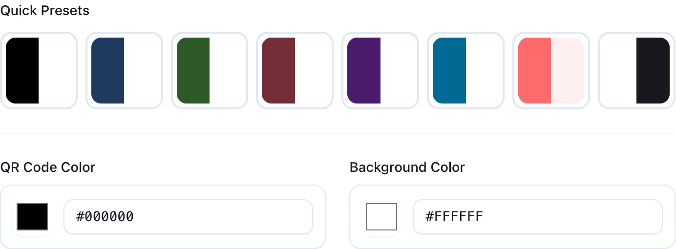
The Basics
Foreground (the dark modules): Traditionally black. Can be any dark color. Needs to absorb light.
Background (the empty space): Traditionally white. Can be any light color. Needs to reflect light.
The Contrast Rule
Aim for at least 40% contrast between foreground and background. Here's how different combinations work:
| Combination | Works? |
|---|---|
| Black on white | ✅ Perfect |
| Dark blue on white | ✅ Great |
| Dark green on cream | ✅ Good |
| Navy on light gray | ✅ OK |
| Gray on light gray | ❌ Too low |
| Red on pink | ❌ Won't scan |
Safe Combinations
Classic (always works): Black on white. Any very dark color on white. Black on any very light color.
Brand-safe: Dark brand color on white. Black on light brand color. Keep the contrast high.
Creative (test carefully): Medium colors, complementary colors, gradients—all need testing.
What to Avoid
Low contrast combinations: Dark on dark, light on light, similar hues. These just don't scan.
Problem foreground colors: Yellow (too light), neon/bright colors (poor contrast), pastels.
Color blindness considerations: Red/green only combinations can be problematic. About 8% of men have some form of color vision deficiency.
Transparent Backgrounds
PNG and SVG support transparency, which can look clean and blend with any material. But here's the catch: you can't control what background it ends up on. If someone puts your transparent QR code on a dark background, it won't scan.
If using transparency, provide placement guidelines: "Use only on white or light backgrounds."
Gradients
Gradients can look great, but both ends of the gradient need to maintain contrast with the background. Don't let the gradient fade into light colors in the foreground—that breaks scannability. Keep the entire gradient in the dark range.
Testing Your Colors
Our customizer warns you if contrast is too low. Don't ignore warnings.
But real-world testing is essential:
- Download the QR code
- Print it (if for print use)
- Scan with iPhone and Android
- Try different distances (close up and from a few feet away)
- Try different lighting conditions
Print vs Screen
Print: Colors look different printed than on screen. Always print test samples. Paper color affects the background. CMYK color space.
Screen: More forgiving than print. Test on multiple screens (brightness varies).
Products/Packaging: Consider the material color. Reflective surfaces are challenging. Test on the actual material if possible.
Common Problems
"My branded blue doesn't scan": It's probably too light. Use a darker shade for QR codes specifically.
"It looks great on screen but not printed": Screen and print colors differ. Print test samples and adjust.
"The gradient makes it unscannable": Gradient probably goes too light. Keep the entire foreground gradient in dark tones.
Common Questions
Can I invert colors (light on dark)? Some scanners support it, but it's less reliable. We don't recommend it.
Should I match my brand colors exactly? If they have high contrast, yes. If not, use darker/lighter variants specifically for QR codes.
Will it look the same when printed? No. Always print test samples.
If you're still having scanning issues after adjusting colors, see our troubleshooting guide.